A Boater’s Guide to Synoptic Charts
July 10th, 2024 by team

by B.J. Porter (Contributing Editor)
Over the last couple of months, we’ve talked about air pressure systems and weather fronts. Now, it’s time to pull some of that together to learn more about reading synoptic weather charts. These charts are the data that meteorologists use to come up with forecasts, and we can use them ourselves to get a more detailed, personal view for our needs.
Professional weather forecasts are valuable tools, and you should always consult them. However, they’re often very broad and focused on land-based weather. Boaters really need more specific information about marine conditions. For that level of detail, you can pay for subscription services and use government marine forecasts. However, those forecasts are still general and may not cater to your specific requirements. The more you know yourself about what you’re looking at, the better your weather management will be.
What is a Synoptic Chart?
A “synoptic chart” is the formal name for a weather map. It’s a visual representation of air masses, pressures, and movements laid over a nautical chart or map to show current atmospheric conditions.
These charts may show present and past conditions, but they’re also produced with future predictions of air mass movement and changing conditions. Those predictions aren’t always 100% exact, but on the large scale of the charts, the movement of large air masses is close enough to identify what’s most likely to happen to the weather over the coming days.
Data shown on the chart
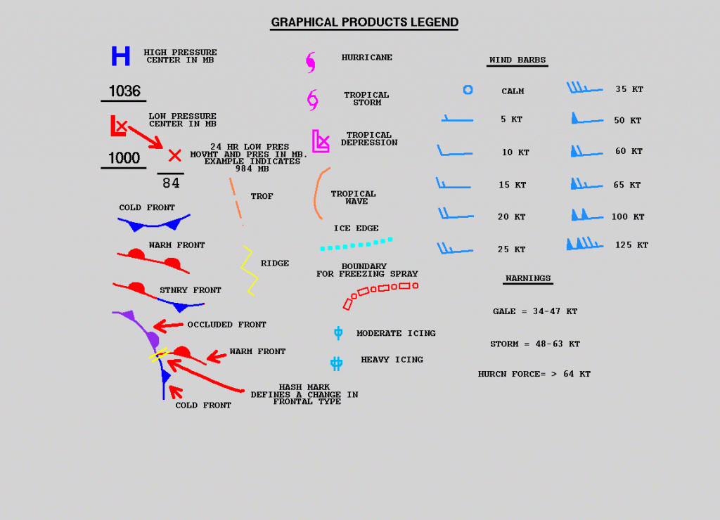
There are several key types of data which every chart will show, and you will need to recognize and understand these notations. We’ll get into more detail on these in the next section, but on a chart, you may find:
- High and low pressure masses
- Isobars, or lines of air pressure readings (more on that later)
- Fronts, and their direction of travel.
- Trofs, or troughs – unstable low pressure ranges, which are marked differently by different weather sources.
- Wind barbs are sometimes shown on analysis charts. These point in the direction of the wind like an arrow with feathers.
- Station plots may have a wind barb surrounded by numbers, showing known conditions at a specific weather station.
There may be specific notations added as well, such as an “X” near the center of pressure masses, directional arrows with speeds for movement of masses, and so on. But the range of symbols used is actually quite small and easy to remember.
The entire reference for all symbols, words, and notation conventions for NOAA/NMS charts is here:
https://ocean.weather.gov/product_description/keyterm.php
Where does the data come from?
The various national weather bureaus which produce these charts draw data from many sources. These sources include automated surface stations, observations from ships, aircraft, and local ground stations, weather balloons, drifting buoys, and satellites. It’s mainly government offices which have the enormous resources to assemble this much data from so many sources. The U.S. National Weather Service (part of NOAA, the National Ocean and Atmospheric Administration), U.K. Meteorological Office, and the Meteo France are some of the larger providers on the northern hemisphere.
Most private weather services which produce charts and models are still basing most of their analysis on this aggregation of data. Although they may have some sensor data and observations of their own, they typically derive the predictions and forecasts sold to subscribers from the same underlying government data.
Types of charts
If you look at the list of charts available on the National Weather Service’s “Radiofax Charts” page, you’ll see several types of charts. These include:
- Sea State and Wind/Wave Analysis and Forecast, Predictions
- Surface Analysis and Forecast, Predictions
- Upper Air Charts
- Other seasonal/specialty, like Tropical Cyclone/High Wind and Wave, Ice Limits, and Satellite photos.
We’re most concerned about the surface charts, though the sea state and wind/wave charts are also good information.

The Upper Air 500mb chart provides excellent tools for forecasting, and can help show rough waters and high-level wind movements. It shows the vorticity (rotation) of air masses and the temperature. A full discussion of the 500mb charts is beyond this article, but we may visit it in a future post if there is interest. But NOAA has a nice overview of it here, and many related weather articles.
Reading the Charts
We’re going to work with the chart below to talk through reading the information on it. It’s a recent 24 hour surface forecast, you can still see the remnants of hurricane Beryl up by Michigan.
Start in the upper left corner, there is an information box. This may be located elsewhere on the page, but it will always describe the chart, an issue date, and an expiration date. Always start there to make sure you’re looking at current data and the right chart. As I write this, it is 15:00 EST (19:00 UTC) on July 9th, so it’s only two hours old.
NOTE: Times are almost always given in the Coordinated Universal Time zone, or UTC. This is the time at meridian zero in Greenwich, England, so you’ll have to make sure you remember to convert to local time. Since weather charts are used all over the globe, they cannot reasonably include a local time stamp on them.
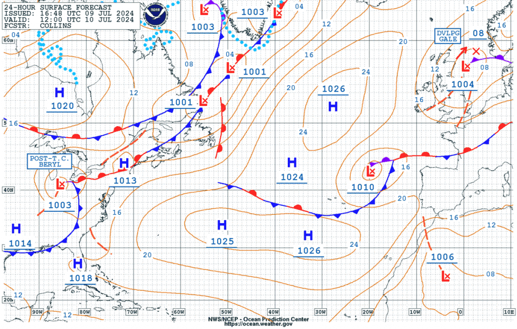
Once you verify how old the chart is, orient yourself to land. Find recognizable land masses and features – Florida is a pretty easy one to spot for north Atlantic charts. From there, you can trace the coast until you reach your sailing area. Also note there is a latitude/longitude scale on the left and bottom edges of the chart, so you can approximate your location if you’re offshore.
The high and low pressure systems on a color chart leap out, as do the fronts. On the same chart shown in black and white, it’s not as clear or readable. But offshore using weather fax, it’s a much smaller file to download. And you need an internet connection if you have an SSB weather fax device on board.
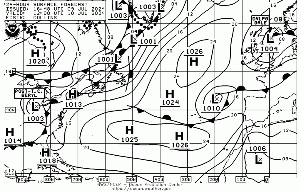
Notice that the information in these two charts is identical, but the resolution and readability are a little different. The newer color charts are easier to read but about 4-5 times the size as the black and white. If you’re downloading them over satellite data, it’s still worth the extra time because even the color file is only a quarter of a MB. You might choose black and white or weather fax reception if you’re using SSB.
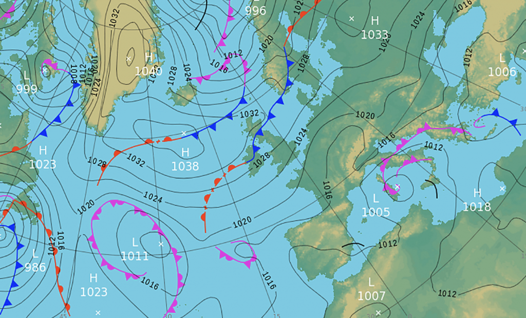
Air masses
The chart marks each air mass, high or low pressure, with an H or an L, along with a number beside it. That number is the air pressure reading at the center of the mass. On this chart, you can see several high pressure masses in the northern Atlantic, one over Florida, and one just north of Texas. Up my Michigan, you’ll see the low pressure remnants of Beryl, noted with special box text.
Isobars
Surrounding each pressure system are circular lines, the isobars. These denote rings of uniform pressure. On this chart, they’re spaced out by multiples of four millibar, but you may see different isobar scales from different providers.
Look at the 1026 mb high off of the U.K. in the north Atlantic. The first ring reads 24, the next 20, the next 16. Those represent 1024, 1020, 1016, and so on, the last two digits only for clarity. Numbers below 1000 mb will show up for cyclones and hurricanes.
An isobar chart is kind of like a topographic map on land, where each line is an elevation level. If you look at a long, gently sloping hill, quite a distance will separate the lines. But on a steep hill or mountain, the lines will be close together.
The same thing applies to air pressure. If you look at that 1026 mb high, you’ll see the isobars are pretty spread out heading towards Europe. That’s a fairly gentle pressure gradient. But headed back towards Greenland, note how close the isobars are as it approaches those 1001 mb low pressure systems. That is a sharp gradient.
Big pressure differences yield higher wind flows between them, so you could expect the winds across the U.K. towards that exiting low to be lower than the winds blowing into those lows off Greenland.
Closer isobars usually mean higher winds as systems approach.
Fronts
The colored lines with triangles and half circles illustrate fronts. Expect weather changes as they move through your area, and refer to our article on fronts for more information.
Movement
Looking in the upper right corner, the 1004 mb low pressure system has a thick red arrow next to it. Last week, hurricane Beryl had a large red line near the center as well, with a second ‘X’. These are expected movement directions, and strong low pressure systems may have that second ‘X’ for the predicted new center.
Fronts tend to move in the direction of their symbols, although occluded and stationary fronts may become parked and move very slowly until the systems move apart.
Troughs
In the lower right corner over north Africa, there’s a dotted line heading north from the low pressure mass there. That’s a trough or ‘trof’ as it may be noted (and pronounced). This is an unstable region of low pressure, where you can expect unpleasant conditions as it passes through.
We can see three other troughs on this chart over North America.
Station plots
Because we used a forecast chart, not an analysis chart, there are no station plots showing. On an analysis chart, you’ll see the real-time readings from stations.

Station plots can clutter up a chart, which is why we didn’t use an analysis chart for instruction. But they provide good information, like the air temperature, sea surface temperature, pressure changes, and wind strength and direction. The station with the red arrow pointing at it shows 83°F air temperature, 85°F sea surface temperature, no change in barometric pressure over three hours, and WSW winds at 230° at 15 knots.

Interpreting what you see
A static reading of the weather chart doesn’t show you very much, just like a spot barometer reading isn’t much more effective than looking out of the window. But the trends, movement of systems, and future forecasts can give you a very clear idea of what to expect when you head offshore.
Compare analysis charts to forecast
The biggest help to you is looking at the forecast movements for the next few days alongside the current analysis chart. This gives you an excellent picture of where systems are, where they are likely to move, and what type of weather might follow that movement.
Start with the current analysis and look at the conditions where you plan to sail. Identify any low pressure systems and fronts in the area. Next, look at the forecasts. Start with the 24 and 48 hour charts, but if you’ll be at sea more than a few days, look at them all. Note the problem features in your area, and see how they’ve moved.
Then, check that against your planned route.
The movement is the key. You want to make sure that low pressure system that’s currently 500+ miles away on the analysis chart doesn’t wander into where you’re planning to travel. If it is, your options are to wait it out, or pick a route different enough to avoid it.
Also check the text forecasts for the region. They’re usually higher level and cover a broad area like the charts, but they will help put plain language and hard numbers onto the graphic reading of the chart.
Stay safe and be careful
No matter what you do, don’t rely on a single source for your weather. Consult professional marine forecasts, then compare them to the weather charts to see what is really going on and how it will affect your corner of the ocean.
Don’t be afraid to ask for help, or even reach out to a weather service if there’s a troublesome system on the horizon. One thing you’ll learn about meteorologists is that they love to talk about the weather, and there are plenty of great resources to learn from.

Leave a Reply