Raster vs. Vector Charts, is One Better than the Other?
December 30th, 2023 by team

by B.J. Porter (Contributing Editor)
In the world of electronic charting, you may come across two types of charts – Vector and Raster. You may use both types with iNavX, and most chartplotters and navigation software can use either type.
So…what’s the difference? Is one better than the other? Should you use one preferentially?
Neither one is inherently better, but many times, one or the other might be better for one specific part of the world.
Raster Charts – Working from Paper
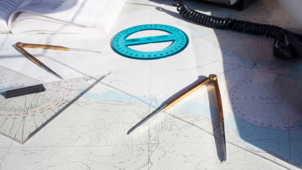
Raster charts are like scans of paper charts. They’re images, fixed in dimension in content, and most raster charts look almost exactly like the corresponding paper charts of an area.
If you’re someone who learned to navigate with paper, dividers, and a straightedge, they’re pretty comfortable. Many also find them more visually pleasing, since the paper charts are usually clean formats with clear, uncluttered markings.
The major disadvantages of raster charts are the size of the charts and the inability to customize the chart display. Since the charts are images, they are considerably larger files. And as fixed images, you can’t filter what you’re showing – what is on the chart is what you get.
IMPORTANT NOTE: NOAA Paper charts and supporting electronic files (Raster Nautical Charts or RNC) are slated for cancellation by January 2025. It’s not the end of all raster charts, but NOAA supplies most of the charts for U.S. Waters.
Vector Charts – a Mathematical Database
Unlike the stored images of raster charts, Vector charts are a database of navigation information, which is translated into a visual display by the chart plotter. That’s a simplification, but the essentials are true. Your plotter interprets compact data into a two-dimensional cartography display.
Storing indexed data instead of pictures is much faster and has an immense advantage because you can display the data any way you want. Tools like iNavX let you customize how much detailed data to show and let you exclude and include certain pieces you don’t need. In addition, you can set custom depth curves and shading, change colors, and customize many other displays to show exactly what you want.
As perfect as this sounds, there are a couple of disadvantages. The most glaring is that Vector chart displays can become incredibly cluttered if you don’t set them up properly. Too many depth soundings, bottom type descriptions, and text notes can make a suddenly zoomed screen illegible. And in the other direction, it’s easy to hide important information accidentally if you’re a little too zealous in your de-cluttering.
Some navigators also don’t think they’re as visually pleasing to use, but that’s more a matter of choice. The bottom line is they can be powerful, but you need to take a little care setting your preferences.
Is One Type Better Than the Other?
Neither chart type is inherently more or less accurate than the other. Though you can give a slight nod to raster charts for accuracy because most vector charts are still translations of existing raster charts to the new format. Vector charts are not the product of new hydrographic and charting efforts, rather they’re created from a human translation of existing charts. So there is room for transcription error. This will minimize over time as new surveys are complete, but that’s always not the case today.
Geographic Availability
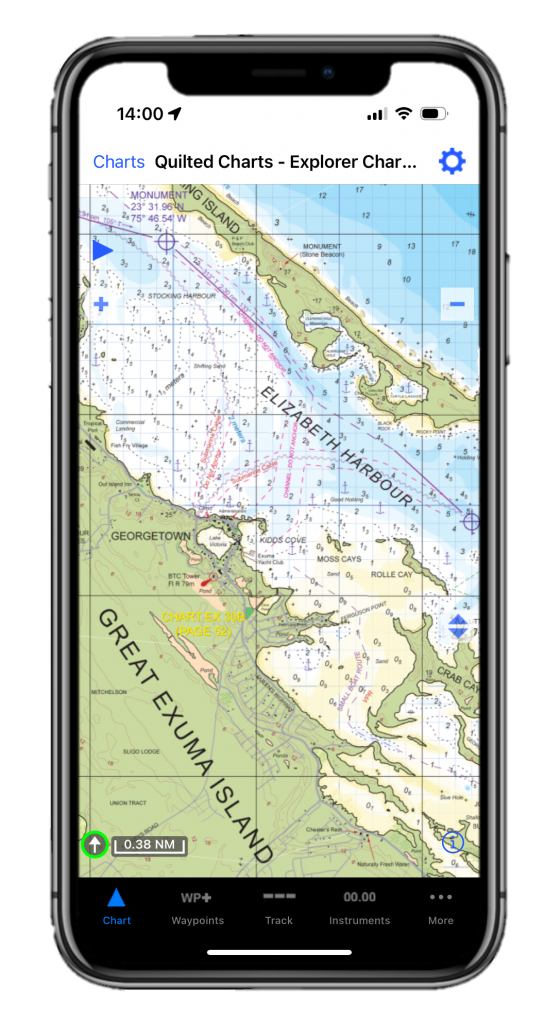
Sometimes, the best choice for Vector vs. Raster is entirely one of availability. The Explorer Charts of the Bahamas are a good example. They’re considered to be some of the best charts of the shallow waters of the Bahamas, but they are raster charts and a better choice.
There are also many areas of the world which have not been converted to vector charts. It all depends on your chart plotting software provider and what is available for that platform.
With chart sources like NOAA eliminating their raster products it will become more of a factor.
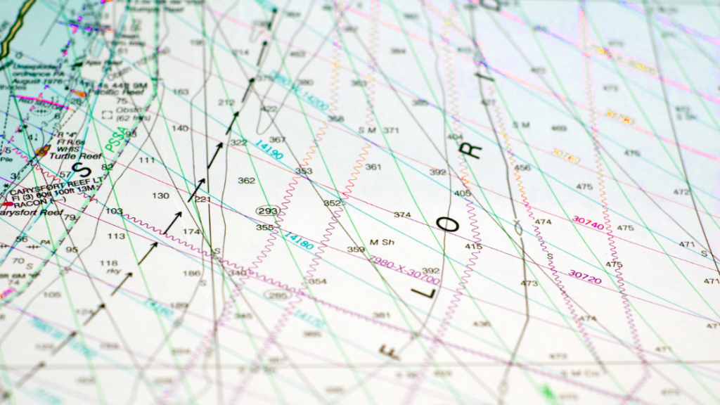
Are there any other differences?
When comparing raster and vector charts side by side, you’ll see the same features and bottom contours. But sometimes where the numbers are displayed may be a little off, or there will be other subtle differences.
It’s important to remember that every chart has scale, which is the level of detail shown on the chart. Small scale charts cover vast areas of ocean, and large-scale charts zoom in on detail, all the way to harbor level resolution. Different chart scales have different levels of accuracy, and if you’re looking at two charts of different scale side by side, you might see that difference.
Both vector and raster charts have a scale, and you’ve got to pay attention because small scale charts won’t have as many rocks, buoys, lights and other markers on them.
To see examples of chart scale, check out the NOAA chart locator for ENC (Vector) charts. You can see each chart available for the U.S. and its resolution. Broad area charts and tiny harbor charts cover the same area, but the larger scale charts cover smaller areas of water in great detail.
And here’s the risk – if you don’t have the large-scale charts on your plotter, it’s easy to over zoom. This is zooming the screen in past the chart’s resolution. This is dangerous because the small scale charts lack detail, and when over zoomed, there might be a hazard that is supposed to be there that isn’t showing.
With raster charts, it’s usually easy to see when you’re over-zoomed because the text and objects on the screen get pixelated. And some plotting software will “quilt” the various raster charts, so the closest scale chart available is showing to prevent over zooming.
Vector charts are easier to over zoom and not notice it because the chart always looks good. Some plotters may warn you when you over zoom, some may not. So make sure you’ve downloaded every vector chart for the waters you frequent. You don’t want to pull into a new harbor and not know you don’t have all the detail you need.
It’s not a risk inherent to the chart type, but it’s one that might lead to accidental user error.
Vector Power
Despite some cautions mentioned above, vector charts are the way of the future. Government agencies are definitely moving away from raster, and we’re not far off from crowd-sourced vector maps and other useful tools. The scalability and performance are unmatched, and the ability to tailor your chart display to exactly what you need is truly powerful.
When you’ve got some time, play with the displays to see what you can show and what you can hide. It may surprise you just how good you can make those vector charts look.

December 30, 2023 at 5:46 pm, Andrew H Quaye said:
It may be a good idea to delve deeper into ‘crowd sourcing’ of vector charts. I have seen situations where someone has added charted features such as rocks shoals and even navigational aids where none actually exist.
January 09, 2024 at 4:31 pm, Mark said:
I greatly enjoyed the article.